
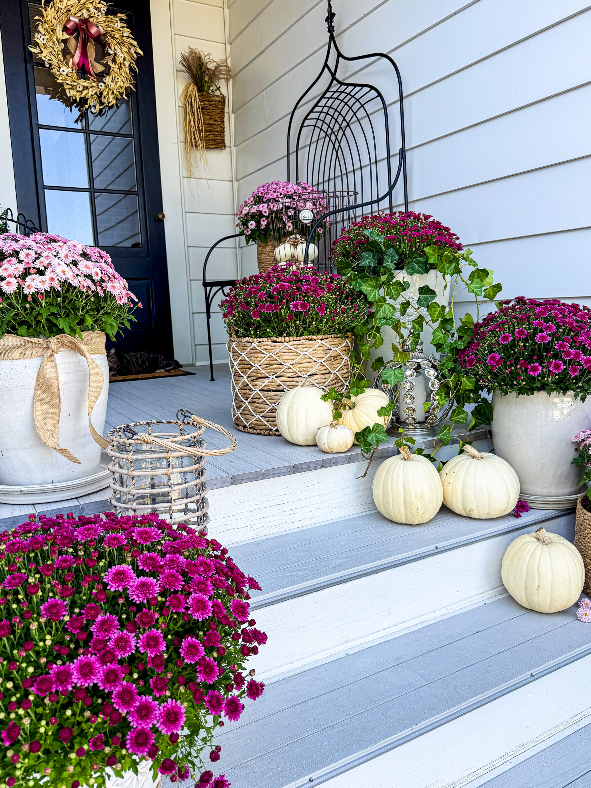
Elevate your entryway by adding rich wine-colored mums that step away from traditional fall colors, instantly giving your porch a more elegant, dramatic, and high-end look.

While there is nothing wrong with the classics, this season offers an opportunity to embrace something a bit more sophisticated. Shifting towards this rich shade creates a front entry that feels luxurious, moody, and enchanting.
Here’s how to create a stunning jewel-toned fall porch that will make your home the standout on the block.

For the main color of the porch, I chose mums in a deep, rich wine tone. To soften the intensity of the rich hues, I mixed in light pink mums to provide the perfect visual pop. It instantly brightens up the space and makes the darker tones look more vibrant.
I already had English ivy growing from one of my summer containers, so I decided to leave it there and pop in a large mum next to it. The strands of ivy trailing down the steps and spilling between the pumpkins added natural movement and made the display feel more connected.

For this display, I needed pumpkins that would complement the rich color scheme, not clash with it. Although blue pumpkins would have been my next choice, I decided to go with white for a crisp, clean look to balance out the wine and light pink colors.

To warm up the color palette, I added a few wicker and rattan baskets. I love incorporating earthy, woven textures like these throughout my home and garden. Not only do they add a natural touch, they blend in with nearly every space, from sophisticated to farmhouse.

One of my favorite pieces I added is a silver pumpkin candle holder studded with diamond-colored jewels, nestled among everything else and a bit of a showstopper detail. The sparkle fits perfectly with the elegant, moody feel of this particular style. I’ve had this for several years and honestly cannot remember where I found it. One of the beauties of decorating year after year is rummaging through the items we’ve collected.

I’m always on the lookout for baskets with a unique design. This bronzy wire basket is something else I’ve had for several years, and for this setting, it was perfect for displaying small white pumpkins.

My cream ceramic containers have been on this porch through multiple seasons now. I love their color and haven’t found a plant yet that doesn’t look amazing in them. A tan jute ribbon wrapped around one fits in perfectly with the vibes of the baskets and dried wreath. It also helped balance out the warm color on the left side of the porch.

The whimsical wreath on my door is one I use often for my fall porches, for a few reasons. The light color looks great against the black door, I can’t see buying or making a new wreath every time I decorate, and it pairs beautifully with almost any ribbon. For this color scheme, I chose silk ribbon in three different shades. I also added more jute ribbon to tie everything in. I didn’t want a big or overwhelming bow, I just wanted a few simple ones cascading from the top, but still visible from a distance.

With rich wine tones, soft pink contrast, warm textures, and a touch of silk and sparkle, this porch turned out more than I had hoped for.


Let me know in the comments which part of this porch is your favorite!

Leave a Reply